


It can be tempting to want to share a particular mind-blowing restaurant meal, or fancy home-cooked one, with social media friends and followers. Instagram has certainly propelled food photography into the mainstream, but there is, in fact, an art to the culinary capture. So how do you take that perfectly styled dinner photo, anyway? Using three example dishes, here are some easy tips.
Wheatberry risotto
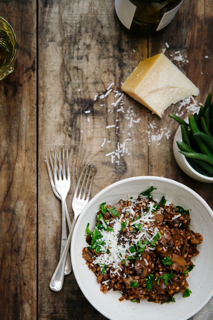
A great image makes the eye travel throughout the whole frame of the shot. To achieve this, try placing your food hero (the focus of the photo) towards the edge of the frame, in one of the corners, and leave the negative space in the middle free of distractions; this way your eye will look down (or up) to the hero, then go around the frame to see the rest of the image, which makes it quite interesting.
You can create a “path” for the eye to follow by placing a few supporting props or ingredients along the same segment where your hero is placed. Remember to keep it simple, as you want all the attention on the main dish.
Gnocchi
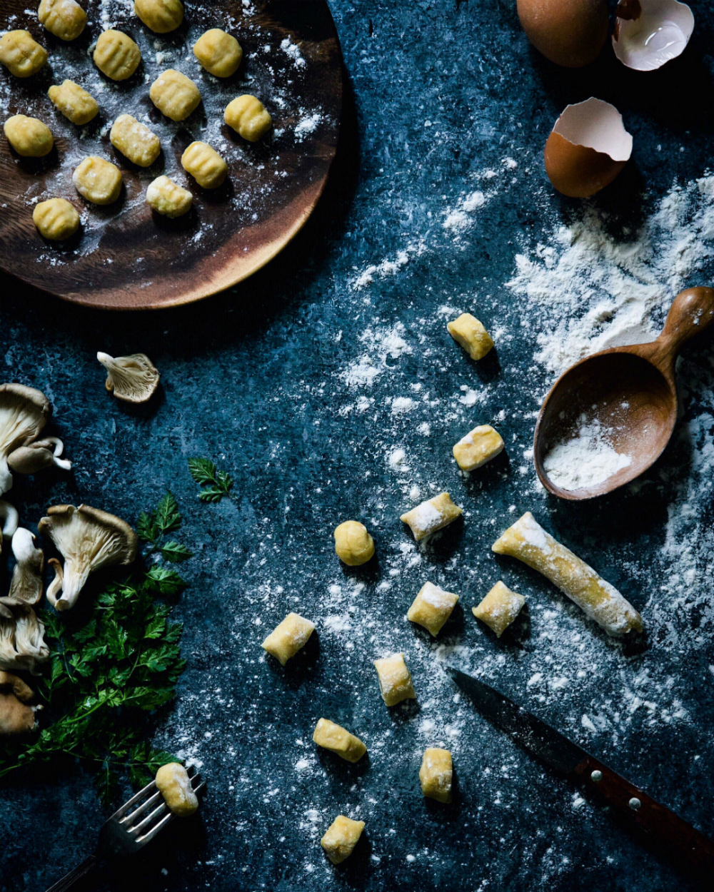
Doing an overhead shot works great with items that lack volume or are too small to make a big impact on their own—in this case, it’s the small (but mighty tasty!) gnocchi. If you were to take the photo on a four-degree angle, you wouldn’t have as big of an impact because the gnocchi isn’t that tall or wide. In this case, the angle combined with a dark background makes the rather small item pop into the frame.
Use dark backgrounds to create some drama and that ever-popular “dark and moody” look. To formulate another layer of interest, add a sprinkle of an ingredient on top of your hero, but don’t overdo it (it’s just a light sprinkle—you don’t want to cover the food). This should be used when you need an extra something to add texture. That said, it doesn’t always work, so try to stay simple and focused on the food.
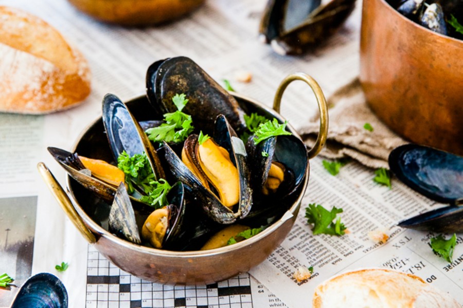
Mussels
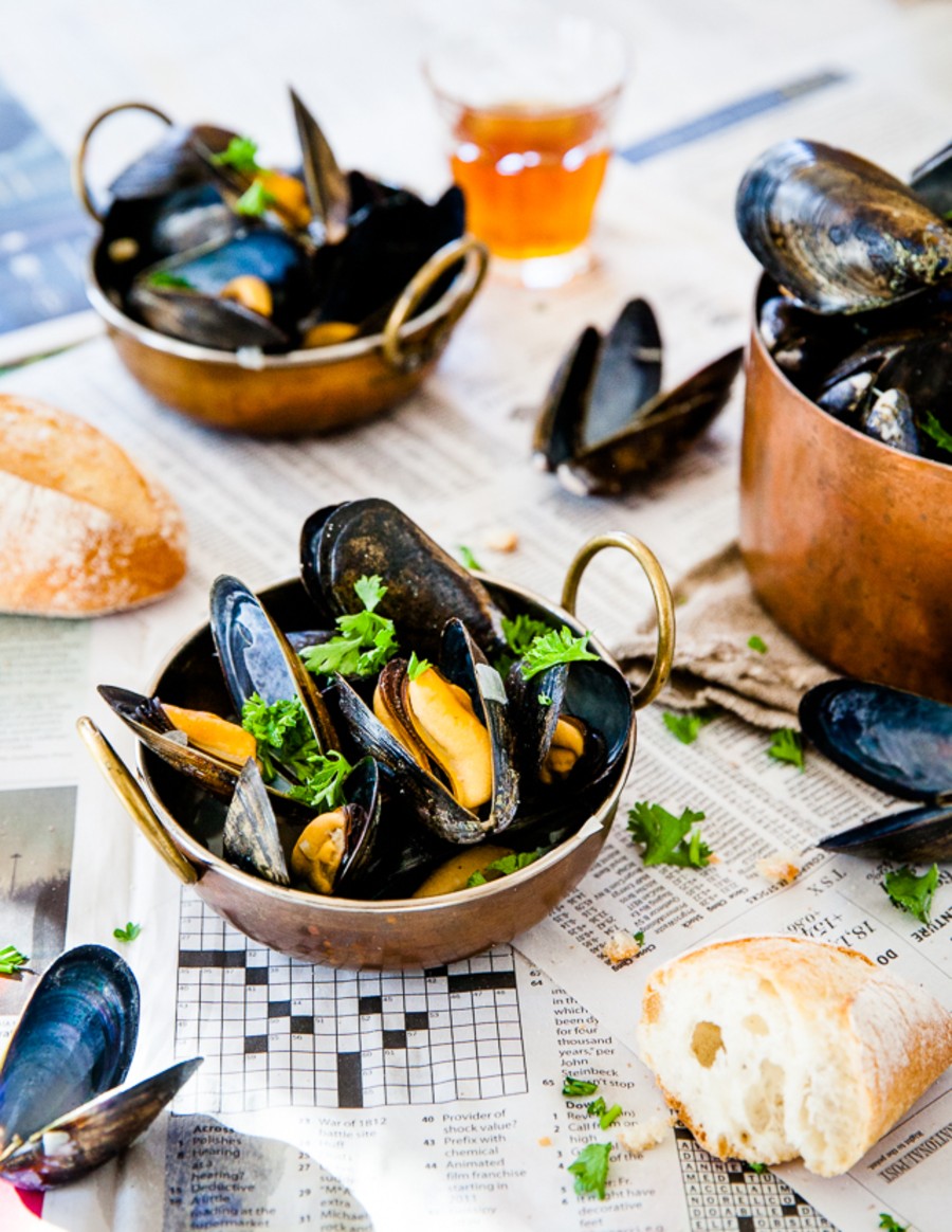
I love using everyday objects as props and backgrounds. Things including books, magazines, and, in this case, newspapers make for some interesting textures that are easy to style and look great in an image. The beauty of using newspaper is that if you make a mess you can just fold that piece and get rid of it—no fuss.
You can use newspaper in different ways: several sheets on top of a table instead of a tablecloth (like in the photo), in a big pile to give height to a dish (for example, a cocktail or a cake), or crumbled and flattened to create a crinkled texture (which looks great with meats). You don’t need to spend a lot of money on expensive linens—just look around you and be creative. Styling is 99 per cent about being resourceful.
This story from our archives was originally published on October 24, 2017. Read more on the Arts.