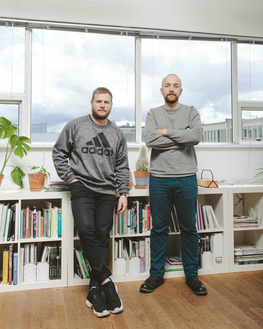
It’s a tale as old as time: effortlessness and nonchalance are the reigning champs of cool. It’s certainly something that comes across in local graphic art and design studio Post Projects’ work—whether intentional or not. Portfolio standouts include visual identities for Brassneck Brewery, Revolver Coffee, and Bambudda, to name a few, each their own emblematic stamp on the visual-driven cultural renaissance currently underway in Vancouver. (Everyone’s an entrepreneur.)
“There’s a lot of heritage-inspired design happening right now,” explains studio co-founder Alex Nelson. “What’s interesting is if you can take something that’s feeling tired and breathe new life into it. But maybe we’re not sick of seeing anything because we don’t care enough to get sick about it.”
“Vancouver is very disconnected from the larger visual culture,” echoes Nelson’s co-founding partner Beau House. “Things going on other places just don’t seem to resonate here.” Nelson nods in agreement, pointing to Vancouver’s lack of proximity to design hubs such as New York.
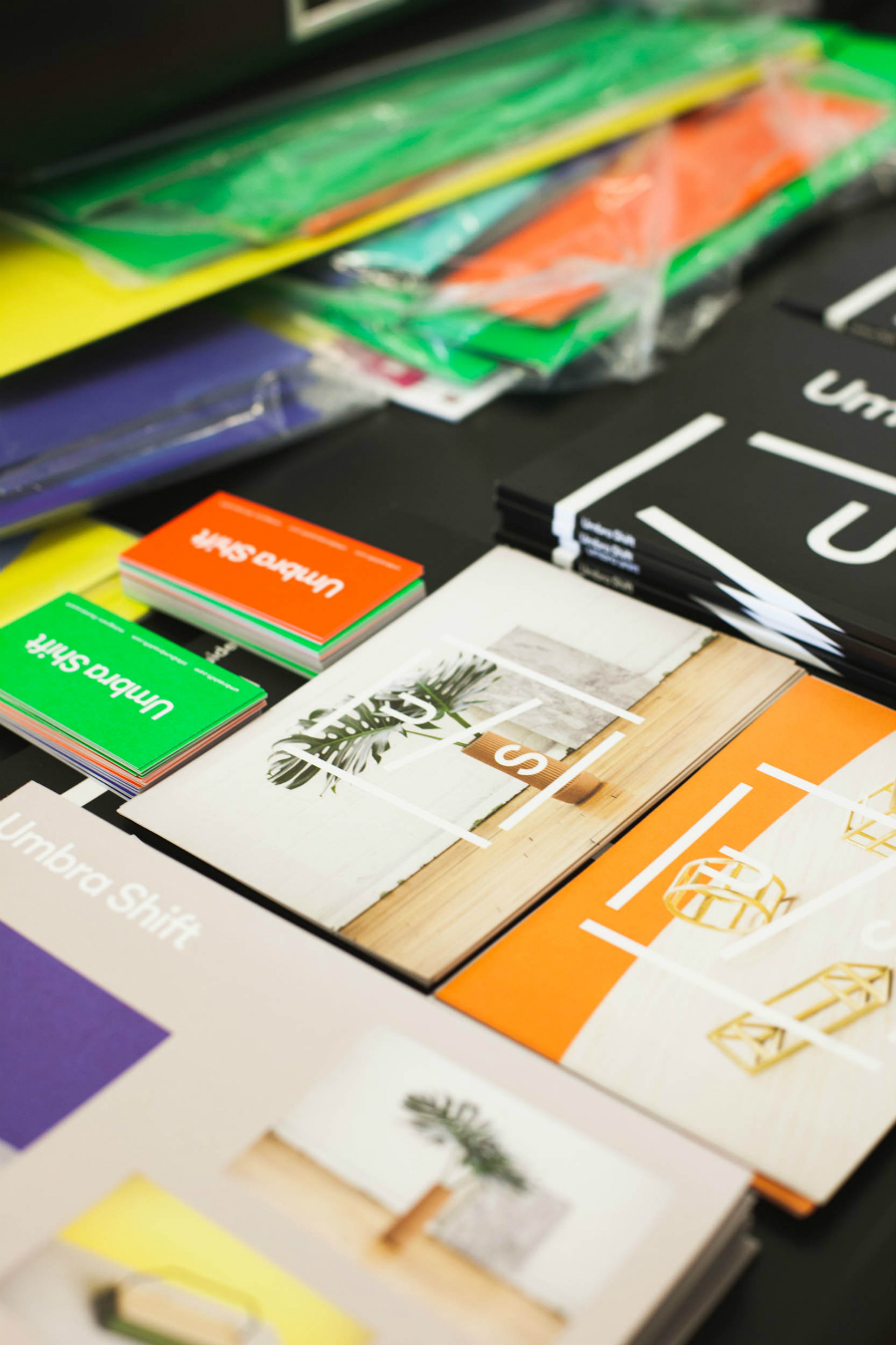
The pair isn’t broken up over the lack of big-pond inspiration, however. “It’s really about learning from your peers here,” explains Nelson, unknowingly alluding to the studio’s roots. Nelson and House met at Emily Carr University of Art + Design, pairing up for projects in their second year. One assignment, titled Push/Pull, had them exploring dualities. “We grouped everything into two categories of persuasion,” recalls House. “Things that are trying to be more alluring and draw you towards them, and things that are more direct, or aggressive, or pushing an agenda.” Viewing their work now, an undercurrent of this undergrad exploration still exists: the alluring simplicity and mise en place quality to their art direction for Umbra Shift versus the heft and direct presence of their Brassneck branding.
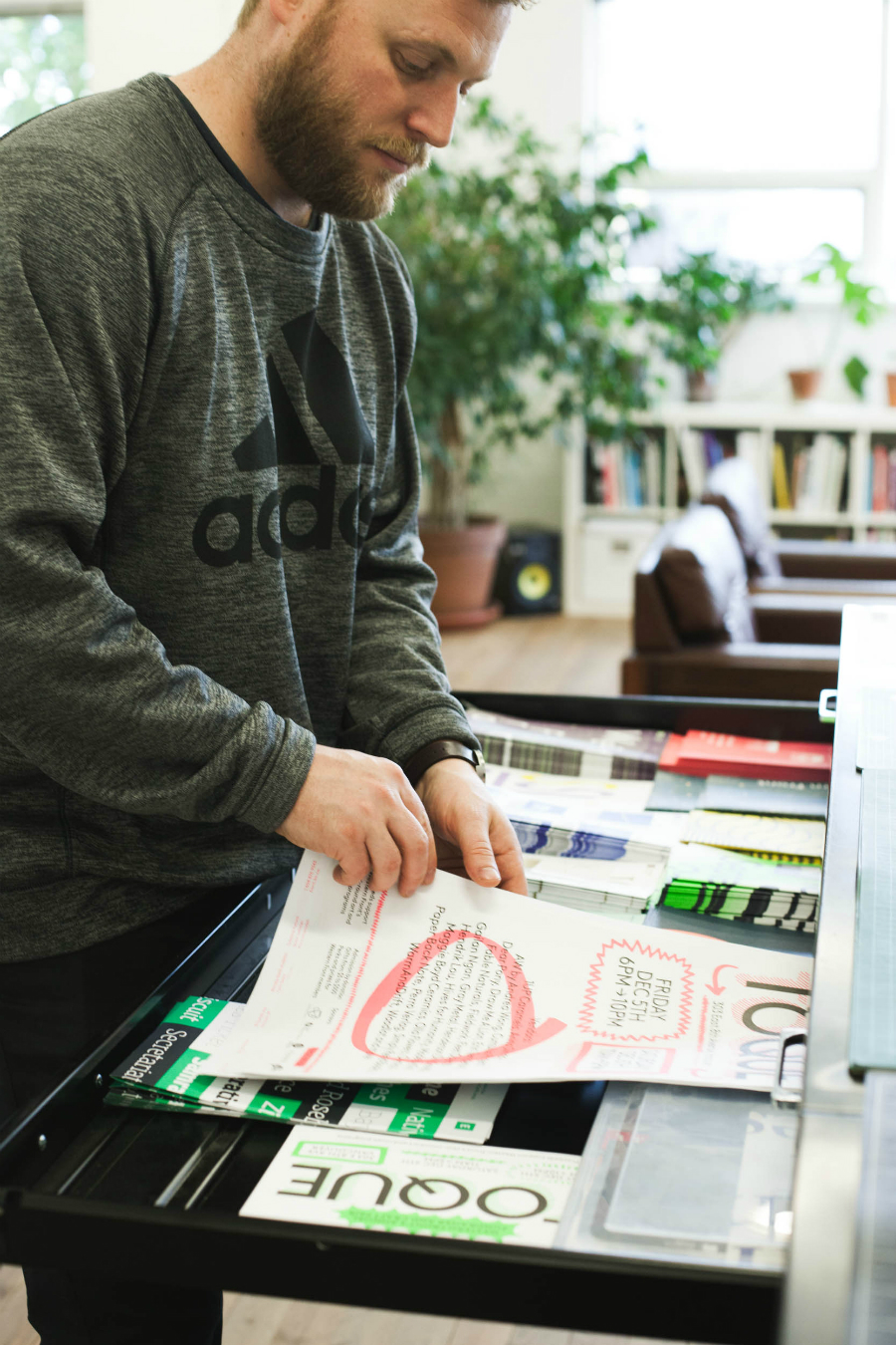
Showing process was emphasized heavily at their alma mater. Nelson gravitates towards typography as he begins exploring, while House builds a book of research and cultural references, the two finding jumping points from each other’s workflow. “I find there’s a lot of tone, personality, and emotion that I can draw from [in type],” explains Nelson. “But a lot of it is just intuition, too. It’s something you build over time. You’re constantly getting sharper. I’m practically perfect now,” he grins. The winning combination of sarcasm and craft is working for the duo, who tend to radiate each other’s perspectives. “Design is design,” states House. “We were talking this morning about people who worship type, who declare type is important, as if that somehow makes them better. Of course it’s important. You’re preaching to the choir and you’re not making a difference, and you’re taking things too seriously.”
While Nelson jokes that they aren’t nice people to work with, they’re quick to admit the learning curve has been steep. “The reason we started a studio was so we could put time and energy into building ourselves a foundation that once built would be really hard to have it pulled out from under us,” says Nelson. “We’re working to build our own thing. With that comes more control, more agency.” Moving forward, the pair will be collaborating with another former classmate, type designer Ross Milne, to include some custom typography in upcoming projects—something that will, no doubt, add to their growing reputation.
Perhaps it can be observed by an outsider that what sets Vancouver apart in design is how studios are establishing a house brand while simultaneously fattening their portfolios—something Post Projects clearly excels at, but would never cop to. Casual is what’s cool.

