


Minimalism has had an extended moment in the late 2010s and early 2020s, from capsule wardrobes and paper-thin laptops to 2019’s Marie Kondo mania. But perhaps the tide is turning. Maybe it’s time to move on from severe Japandi blacks and off-whites to something more comforting, more humane, and more lively. Writer and curator Charlotte Abrahams thinks so. In her new book Love Pattern and Colour she explores an aesthetic as busy as it is beautiful.
This extract from the book, out September 2021, is reprinted with permission from Frances Lincoln, an imprint of The Quarto Group.
When I first set up home in the mid-1990s, pattern was out of fashion. I was a design writer, a person supposedly in tune with interior trends, so I tried to embrace the plain and the minimal, but I felt ill at ease in my patternless house. Without a pop of print to attract my attention, my eye had nowhere to go, nothing to focus on; plain walls, plain floors and plain furnishings left me feeling as flat as the rooms themselves. Without pattern, there was no depth, no movement, no standout feature and, above all, no joy.
Perhaps I was doing it wrong. I know plain can be interesting but unless it is offsetting pattern, it doesn’t interest me. And that’s why I’m writing this book. I love pattern and I want you to love it too. More than that, I want you to bring it into your home and make it part of your life because I believe that living with pattern is good for us. It lifts our spirits. It also makes up for all manner of architectural imperfections and is brilliant at hiding domestic detritus from dust to dog hair. Cheering and practical, what’s not to love?
But how do you live with pattern? How do you choose? Are you blousy flowers or chic pinstripes, Baroque damask or carefree polka dots, pastoral toile de Jouy or urban geometry? And once you have found your style, how do you bring it into your home?
Full of fresh summer sunshine, the success of this scheme rests on the geometric motifs that run through both the wallpaper and the tiled floor. the strict blue-toned colour scheme also helps to tie the layers of pattern together. Design by Osborne & Little.
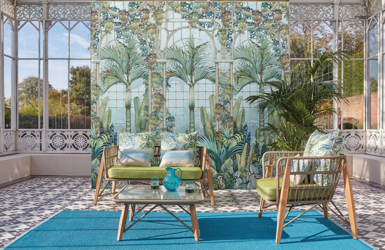
Botanicals
Plants, leaves, fruits and trees have been used as decorative motifs for millennia, from the carved stone acanthus leaves that ornament the tops of Ancient Greek Corinthian columns, to the ‘pomegranate’ pattern of Renaissance fabrics with its pine cones and thistles, and the iron and glass beanshoots and seedpods that can still be seen decorating the entrances to many of Paris’s art nouveau Metro stations. Why have they enjoyed such enduring popularity? The fact that the physical structure of many plants is perfectly suited to pattern making certainly plays a part, as does the fabulous colour palette, but essentially it comes down to this: we are drawn to botanical images because they remind us of the natural world and that makes us feel good.
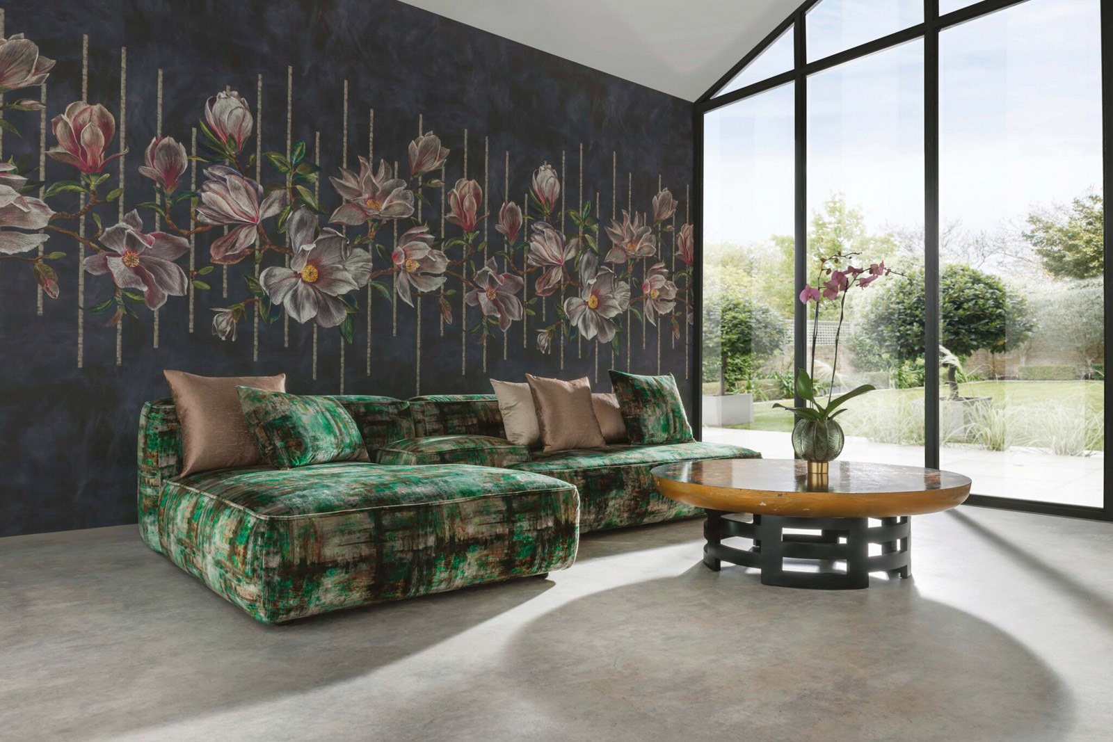
This sitting room is a celebration of jungle style, but it is also a perfect example of how to combine several different bold patterns in a way that is inviting, rather than overwhelming. the primary pattern comes from the wallpaper which, with its vertical rows of trees, has a rhythm and structure that anchors the entire scheme. the more fluid lines and lighter background of the curtains and upholstery provide a balancing second layer, while the geometric patterns of the cushion and radiator cover make up the third. Design by Mindthegap.
Combining softness with structure and spanning looks from playful, hothouse bright to lush sensuality via the stripped-back minimalism of winter trees, jungles and forests are now among the most popular sources of inspiration for contemporary pattern makers. these images show what can be achieved when you fully embrace the theme. Bold, yes, but also beautiful.
Using the same pattern in two different colourways is an interesting, modern way to get the all-over pattern look. this is a busy design, but the simple lines of the motifs and white background mean that it doesn’t overwhelm. Design: Angie Lewin for St Jude’s.
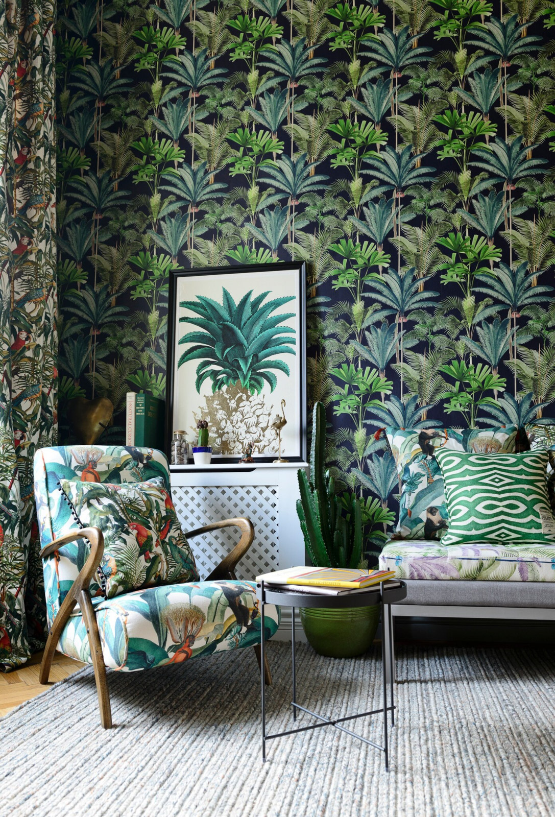
Take jungle and forest patterns off the wall and onto decorative accessories. Rugs, cushions, upholstery and tableware can all be used to bring the outdoors in. Pattern-filled accessories such as these can be used either to add a bright and cheery pop to otherwise plain schemes, or as the final flourish to a maximalist look so embrace them, whatever your style, and have some fun.
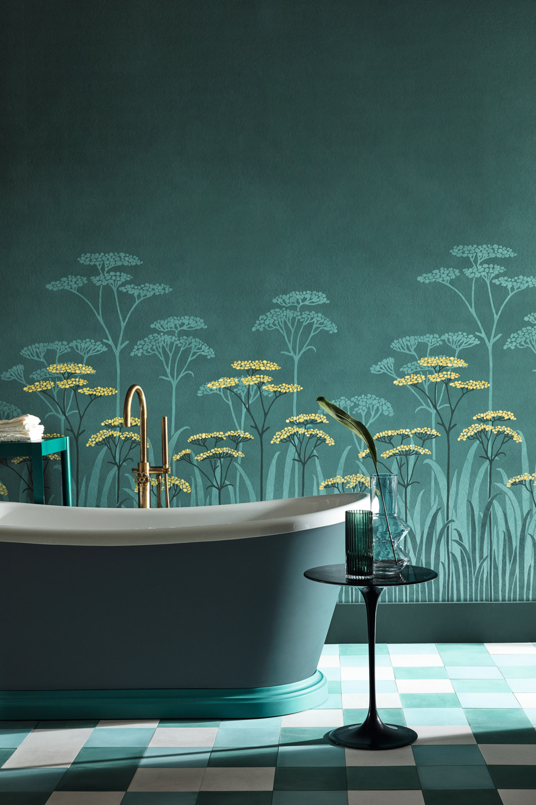
Country style meets modern luxe in this bathroom thanks to the brooding colour scheme and the juxtaposition of the delicate seedheads with strong geometric floor tiles. While the colour scheme adds drama, the seedhead design creates a soothing backdrop for a relaxing soak. Design by Little Greene.
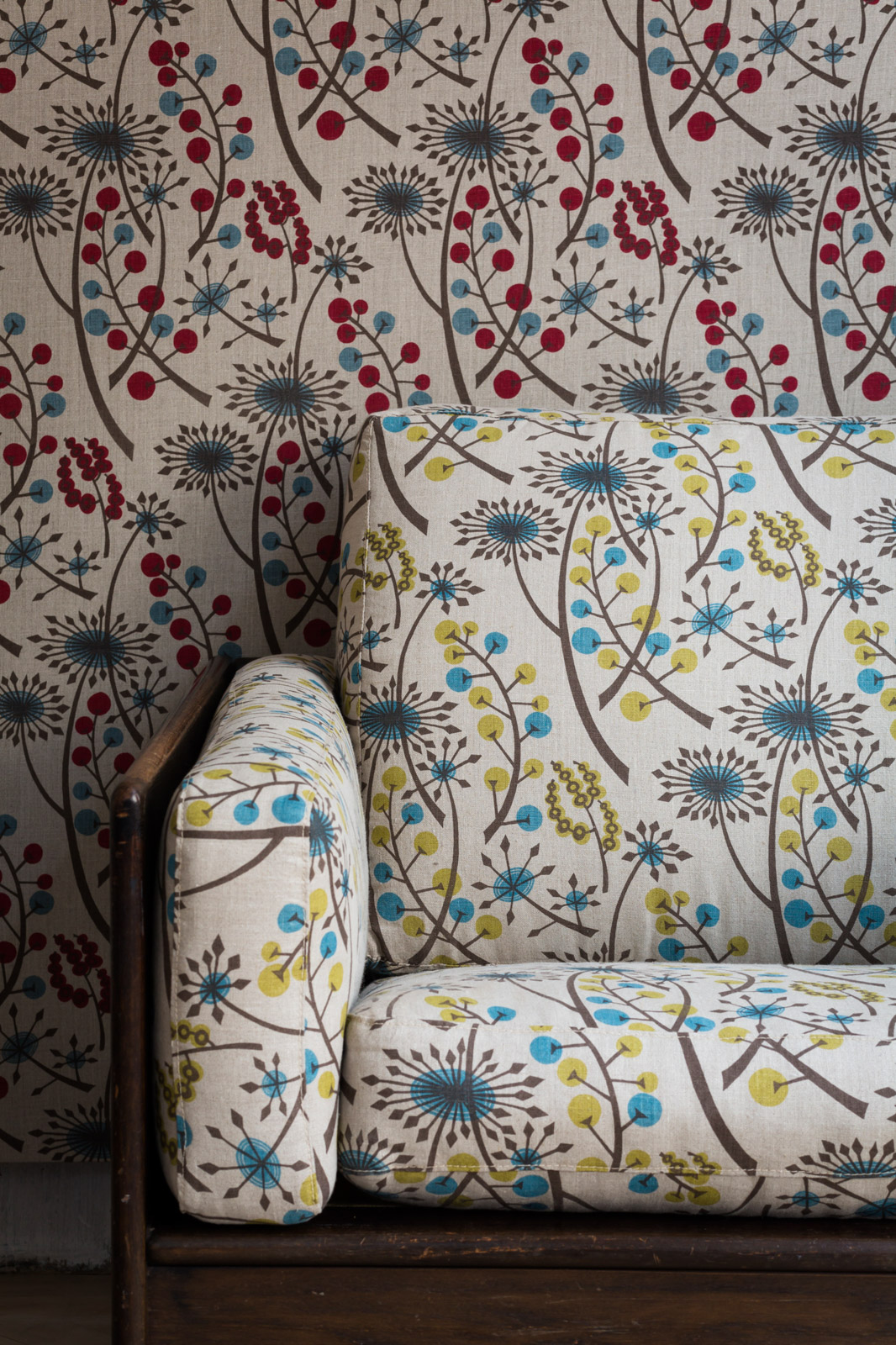
Taking their inspiration from the grasses, seedheads, wild herbs and even weeds that grow in our meadows and gardens, these patterns are a prettier take on the botanical look. less demanding than their more exotic cousins, they are easy, and joyous, to live with.
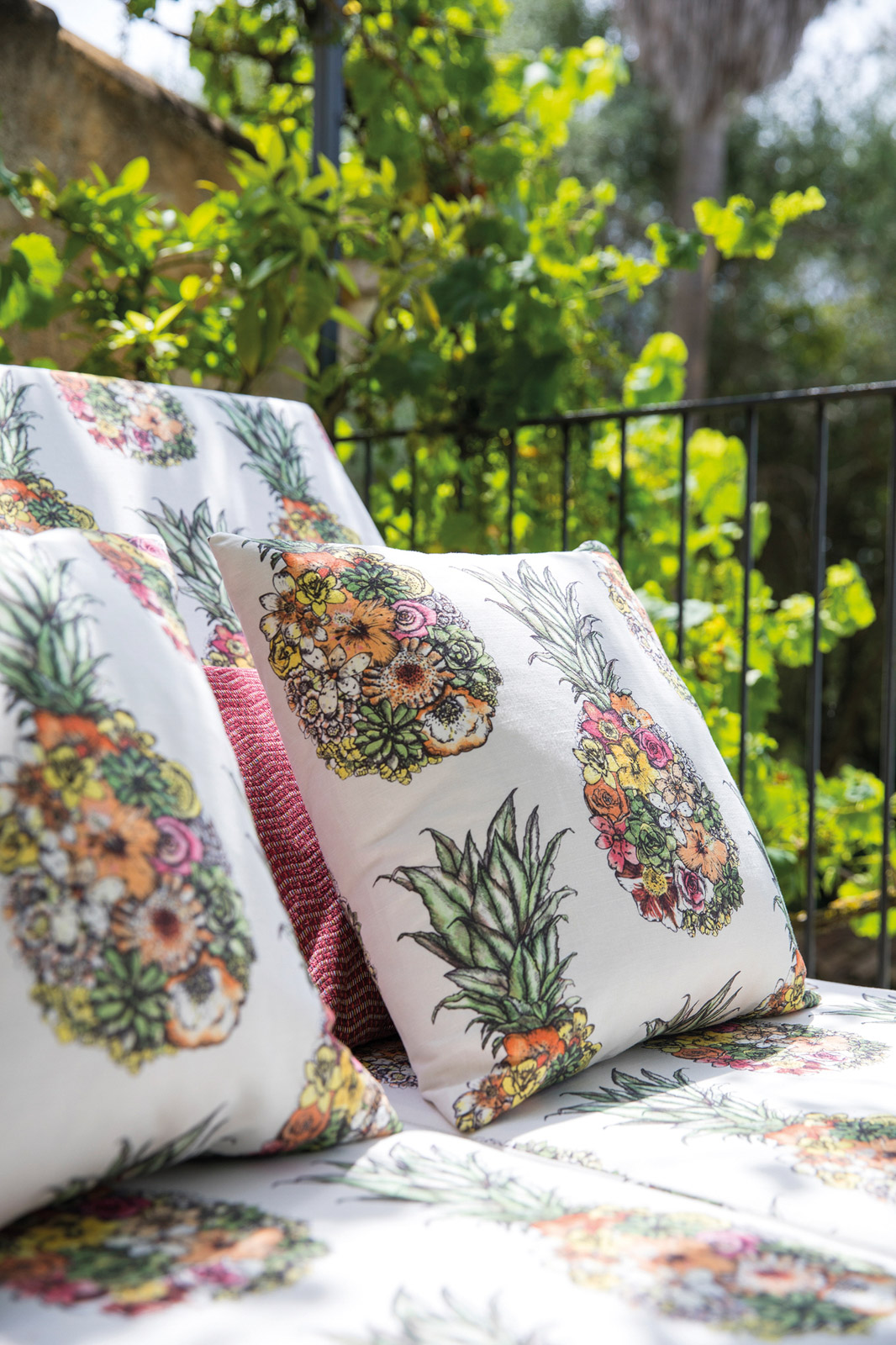
Sculptural and a little bit kitsch, pineapples are the pattern designer’s most favourite fruit. Perfectly suited to decorative accessories, if you want to conjure tropical chic, pineapple-print cushions are the way to go. Design by Mathew Williamson at Osborne & Little.
Stripped back to their essential forms, trees, leaves, fruits and all things botanical take on a graphic, modern look that suits even the most urban interiors. the shapes they create lend themselves perfectly to creating patterns, so these elementary botanical motifs provide an undeniably sophisticated edge.
Read more Design stories.