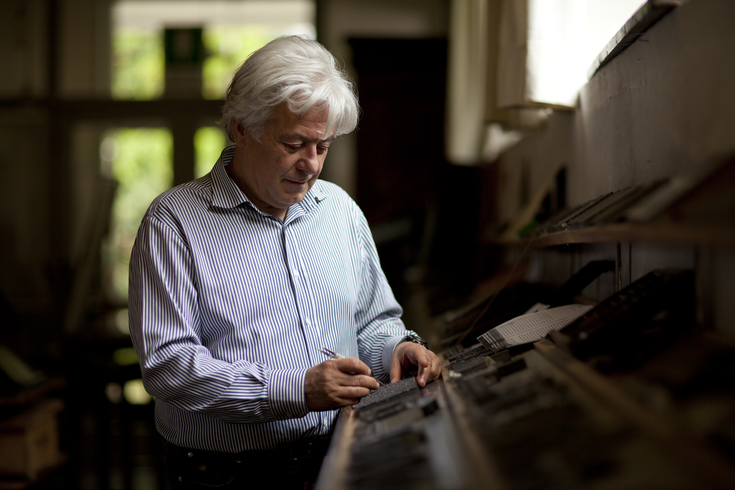


Enrico Tallone’s hands are heavy but precise—the hands of a craftsman—as he follows the swoops of an imaginary letter f with his fingers. His thumbs are broad and steady from a lifetime of holding rows of metal type in place on a composing stick—a centuries-old printing practice that has nearly disappeared from the world, replaced by typewriters, computers, and laser printers. Working with his hands gives Tallone an attention to every detail, from the slant and arch of the letter, to the balance of its crossbar, to the delicate weight of its terminal point. The f, he says, is always the most difficult to get right when designing a typeface. That single letter has a central role in the story of the Tallones, their familial typeface, and the family’s legacy among a disappearing breed of traditional printers.
Enrico’s grandfather Cesare was a portrait painter, a bohemian eccentric who trailed happily between success and bankruptcy and kept company with the late-19th-century artistic elite of Milan and Paris. Cesare’s son Alberto followed his father into the arts, selling rare books in Milan before leaving for Paris to apprentice with the master printer Maurice Darantière—best known for his first edition of James Joyce’s Ulysses. There Alberto buried himself in the typesetter’s trade, looking backward to the breezy, humanist style of Renaissance printing even as the world around him moved forward into stolid modernist, mechanized type.
After he purchased Darantière’s workshop in 1938, Alberto worked with the master punchcutter Charles Malin to design his own typeface inspired by the Venetian architect Andrea Palladio—a balance between French practicality and Italian romance. The italic lowercase f was the last letter he designed, and for a while it eluded him, until—in a fit of inspiration—he scribbled the perfect example on a tablecloth in a Parisian café and rushed it to Malin to be engraved by hand in the end of a metal punch.
Growing up between Paris and Italy, Enrico was surrounded by art and literature—and his father’s printing trade. After Alberto’s death in 1968, his wife and sons carried on the family legacy—printing books including Shakespeare, Emily Dickinson, the Book of Genesis, his father’s beloved Dante, and the Chilean poet Pablo Neruda’s La Copa de Sangre, the text of which Alberto had been eagerly awaiting at the time of his death.
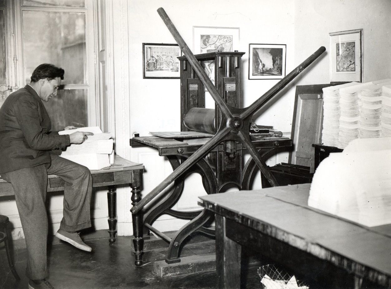
Enrico Tallone’s father, Alberto Tallone, in his Paris workshop. Courtesy of Tallone Editore.
Enrico’s understanding of printing takes its metaphor from the snow-capped Alps that rise above the family printing studio in Alpignano, on the outskirts of Turin. “When you compose by hand, the composer has to be like a man who is climbing a mountain, to find the right path for the spacing that renders the compositions harmonious,” he says, miming the unhurried pace of a hiker with his fingers. “The proximity of each letter and the space between each word must be thought out precisely to create this simple ease of reading.” The workshop produces only 600 books a year, each one printed by hand with the same methods used at the height of the Italian Renaissance. The work is done only by Enrico, his three children, his mother, and a cousin.
Tallone would never dream of printing Italian poetry in the shrapnel-sharp serifs of German lettering or Shakespeare in businesslike Times New Roman.
To open one of Tallone’s books is to experience a sense of lightness and openness that is strange to the reader of modern industrially printed books. The rhythm of words and letters is slightly irregular, and the gentle variation of ink on the creamy cotton-paper page draws the eye along and downward.
Poi—“then” in Italian—Dante begins many of his stanzas. In Tallone’s editions, the space after the word is slightly drawn out, as if to create a suspenseful pause before the next step up the slopes of Mount Purgatory. The job of the printer, Enrico says, is to be an invisible mediator between author and reader, in touch with the intention and context of the literature but so transparent that the reader only experiences the easy flow of the text.
Tallone’s process differs very little from that of printers in the 15th century, when the first italic types were cut to publish the works of writers such as Petrarch, Aristophanes, and Cicero. Each sheet is printed individually, composed with a series of hand-cut steel punches representing a letter, space, or punctuation mark, placed by the compositor—who must master the skill of reading the page in reverse.
Since the Renaissance, printing has transformed many times over. With a technique called stereotyping (a word that has since been adopted for metaphorical use), printers cast a page from stamped wax or plaster so it could be duplicated indefinitely. Then came linotype, huge machines dripping hot lead rolling out thousands of copies of newspapers. Then came computer printers, and the mathematically defined vectors of digital typefaces.
Tallone eschews all of that. It is the imperceptible flaws, he believes, that give his books their vibrancy. “Perfection is death,” he says. “It is the slight imperfection that is life.”
But even before the act of printing itself come the critical choices a printer makes to match the typeface to the text. This is an art that has been lost in a digital world flooded by cramped Times New Roman, bland Arial, and corporate Helvetica, where publishers have less and less power to craft the reader’s experience.
If you are reading this article on a printed page, you are experiencing at least a little artistic choice in typesetting. These words are printed in Arno, a digital typeface that, like Tallone, draws inspiration from the Italian Renaissance and the calligraphic style of the 15th-century Venetian printer Ludovico degli Arrighi. If you are reading on a computer, you may see the same typeface, or it may be flattened into a more generic font to shave milliseconds off the time it takes to load the page.
But Tallone’s handmade prints exercise a greater level of discernment than anything possible on a computer. He prints primarily in three typefaces: Garamond, a beloved Italian style interpreted by a 16th-century Parisian engraver; Caslon, an upright, baroque English type; and the family’s own Tallone. Many others, from neoclassical to postmodern, are kept in wooden cabinet drawers in his workshop, each meticulously labelled with white paper. Each typeface is used to its own effect and in its own place—Tallone would never dream of printing Italian poetry in the shrapnel-sharp serifs of German lettering or Shakespeare in businesslike Times New Roman.
Even though these fine distinctions don’t necessarily enter the conscious awareness of a reader, unconsciously it is immediately apparent—drawn from some kind of collective cultural memory—that the lyrical Italian types are made for philosophy and poetry, whereas the brash brutalism of modernist lettering is better suited to advertising. As with clothing or architecture, we know the meaning of symbols that we have never been explicitly taught. “The first form of culture,” Tallone says, “is sensibility.”
If his father was a guardian of the traditional ways of printing, Enrico is an ambassador for them. It was on a trip to Canada to share his work at Vancouver’s Italian Design Weeks that I sat down with him. As well as literature and poetry, he brought with him a copy of his four-volume Manuale Tipografico, a collection of essays on and demonstrations of the art of typesetting. Each of the 249 copies that have been printed is a trove of centuries of craft passed down through the Tallone workshop, including lovingly inlaid samples of traditionally made paper from workshops across Italy. In recent years, the Tallone workshop has also set up a website displaying an archive of metal typefaces, as a resource for far-flung students of typesetting.
Tallone’s job as a practitioner of traditional typesetting, he stresses, is not to jealously guard a romantic past. He is not, as he puts it, a “folklorist” of printing, and as he pores through pages of carefully laid out type, he delights in all forms of the printed word, from ancient to modern. But what he holds fast to is how the careful hands of an artist transform a page from mere type into something more.
As Pablo Neruda wrote in an elegy for Enrico’s father, Alberto: “But in your books, small castles of man, beauty and clarity remain alive.”
Read more from our Spring 2025 issue.